Mina sidor - Arbetsförmedlingen
We started as a team with the task to create a new version of Arbetsförmedlingens My Pages (Mina Sidor). The initial version was a single page with links to the various applications available such as activity reports (aktivitetsrapportering), work profiles (profiler) and support and compensation (stöd och ersättning). What we ended up doing was a completely new redesign which is continuously improving.
TL;DR
Summary
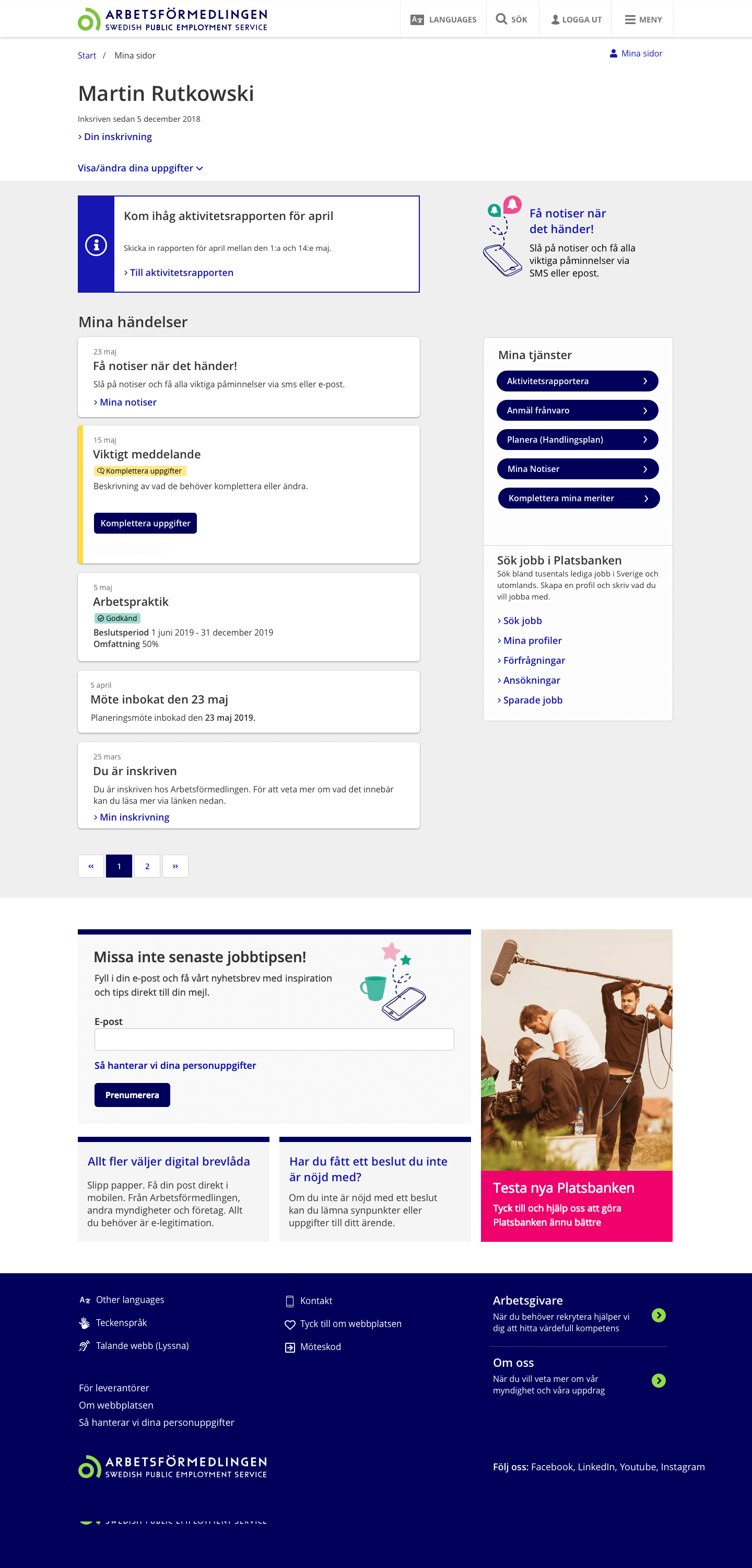
Create a new product to replace the old one. A homepage for customers. We created a dynamic page with a timeline approach. The most important and pressing notifications where always at the top and with each new notification a timeline is created. Similar to social media posts in a vertical list.
Outcome
An intuative easy to understand page. Other teams could send in cards to the customers so that each person had a unique experience. Everything you see on the page is relevant to your story, your needs as a customer.
- Timeline: 2018 - 2019
- Roles: UX Designer, Researcher, UI Designer
- Tools: Sketch, Accessibility
My Role
I was assigned as the interaction designer for the team. My role was to, with the team, come up with the new site, its functions and how they behaved. What the new version would look like and would include, was ut to us to decide.
Challenge
The first huge challenge was to map out and understand the whole organization. This is after all one of Sweden’s largest government agencies. But most importantly, understanding who the customers where, what their situation was and how they used Arbetsförmedlingens resources had to be investigated.
Approach
When we had grasped the challenges above, we started to lay out a plan and a road map. I visited different locations to hear from the customers what they expected to have on such a page and through online data that had been sent in. We had many workshops and I made sure to work closely with colleagues from teams that where stakeholders in our product.
Working very closely with our developers, I sketched some skeleton pages that would be the groundworks in which the product would grow. This to maximize our productivity and to be able to implement new variations of functionality with minimal effort. I like to say that I work with user experience and developer experience.
Result
Some important functions for customers identified are:
- Being reminded of the mandatory monthly reports on their activities.
- Get quick information about events concerning them during their journey to find a job
- Easily find their functions and find relevant support that they can get.
What we created was a page with events similar to cards on social media. Everything stacks with the newest event on the top. In other words, the most relevant information for the customer is always on top of the page. Another important function we created was reminders through email or sms for each new event that comes in.
The results look something like the picture included on this page. The work is continuing and improving with each new sprint.